
Troves are slowly taking shape and it is so nice to see the various colour combinations you have all came up with. We’ve been having a lot of fun here at the shop trying to create as many variations as possible. With 38 different colours of Ulysse available picking your own palette can definitely feel a bit overwhelming. To help you in this endeavour we have gathered some of our favourites colour choices as well as photos of some of the #yaktrovekal participants’ swatches. To join in click here.
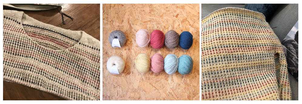
Like in the original design using a light neutral as your main colours is an effective way to make the CCs (contrasting colours) stand out. A neutral background also helps matching the CCs in between them. In her version Wendy used Goeland combined to Quartz, Bois de Rose, Poivre and Nuit. The subtle contrast in between Goeland, Quartz and Poivre really brings out the Nuit and Bois de Rose. Stephanie chose Sel as her main and Creme Anglaise, Bois de Rose, Ciel and Lagon as her contrastings. This soft mix of pastels works really well together and gives a cool retro feel to the garment.
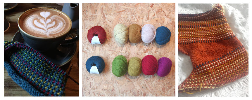
A dark background usually works better when paired with lighter and complementary colours. Complementary colours are colours which are opposite of each other on the colour wheel. When placed next to each other they also create the strongest contrast. Such pairs include red/green, blue/orange and yellow/purple (traditional RYB Colour model) as well as cyan/red, magenta/green and yellow/blue (RGB colour model). Emma’s palette features several complementary pairs which make the ensemble very harmonious and balanced. Her pairs are; Nuit/Genet, Printemps/Pavot and Genet/Confiture de Rose.
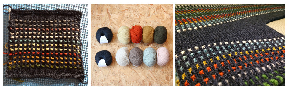
Another strategy consists in combining colours of similar hues but with different tones. Like with Kate’s combination of Fauve, Creme Anglaise and Dore. In addition Nuit works as a complementary Colour of Fauve while Quartz brings extra light.
On the other side of the Channel, Isa has chosen the new Tempete as her main and has added no less than 8 cc to go with it. In the end she narrowed her former selection to 6 cc including Poivre Blanc, Lagon, Dore, Potimarron and Granit. The green was hand dyed by Isa herself but could be swapped over with Printemps. Tanya is also using one the new colours – L’Heure Bleue – for her background combined to Printemps, Sauge, Creme Anglaise and Dore.
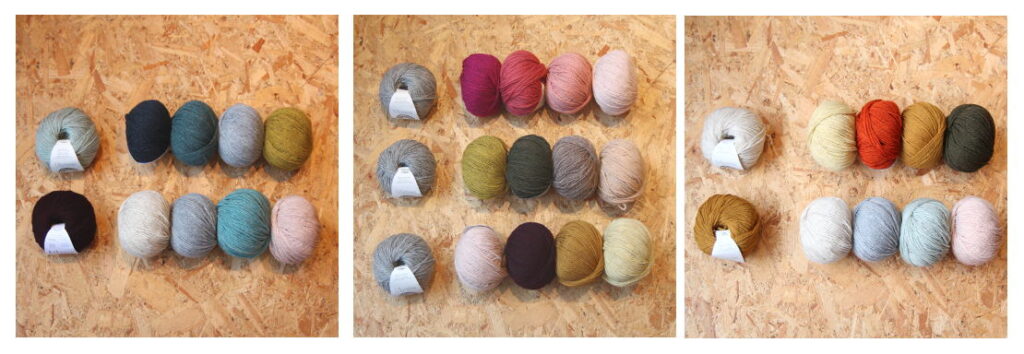
Here are some of the other colour variations we came up with.
- Top left – MC: Sauge – CC: Cypres, Iroise, Brouillard and Genet
- Bottom Left – MC: Merlot – CC: Poivre Blanc, Brouillard, Lagon and Quartz
The three combinations in the middle use Goeland as their main colours. CCs are from top to bottom;
- Confiture de Rose, Bois de Rose, Argile and Quartz.
- Genet, Foret, Poivre and Dune.
- Quartz, Merlot, Dore and Creme Anglaise
- Top right – MC: Poivre Blanc – CC:Creme Anglaise, Potimarron, Dore and Foret.
- Bottom right – MC: Dore – CC: Poivre Blanc, Brouillard, Sauge and Quartz
Our Trove KAL will end on November 30th so there is still plenty of time to join in. Remember that even if you don’t finish your Trove by then you will still be in for a chance to win a Knit About Winter gift set. This prize will go the best WIP photos so make sure to share your images on Insta using the hashtags #yaktrovekal or by posting them on our Ravelry group chat.
Until Next Time… Happy Knitting!


 No products in the basket.